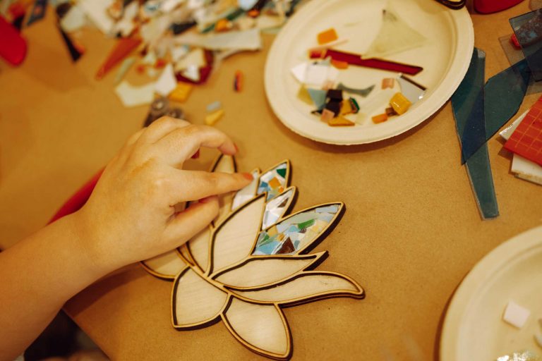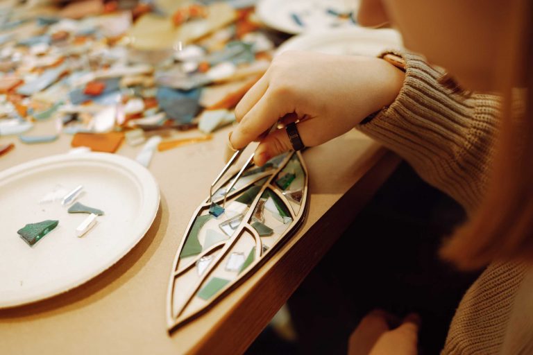

Stained glass is not just about cutting and assembling pieces of colored glass—it is about creating a visual symphony. Understanding color harmony is essential for designing pieces that captivate and resonate.
Why Color Harmony Matters
Colors evoke emotions, guide the viewer’s eye, and enhance the narrative of your artwork. Poorly chosen combinations can make a design feel chaotic, while harmonious palettes create balance and unity.
Tips for Achieving Harmony
- Start with a dominant color: Choose one color that sets the mood and tone for your piece.
- Use complementary accents: Small accents of contrasting colors can highlight details and add depth.
- Consider gradients and shading: Smooth transitions create a sense of flow and elegance.
- Experiment with textures: Matte, opaque, and textured glass can influence how colors interact under light.
Bringing Theory to Practice
Try creating small sample panels experimenting with different color combinations before committing to larger projects. Observe how natural light affects each color at different times of day. Keep a notebook to track your discoveries, sketches, and reflections.
By combining technical knowledge with personal intuition, every stained-glass creation becomes a narrative in color. Developing an eye for color harmony not only enhances your artistry but also makes your work more engaging to viewers.